

Exhibited Press
Layout Previews!
Posted by Kitty (#1) on 4th Jul 2011
44 Comments
In honour of reaching 10,000 members...
I think it's no secret myself and Rykos have been working on a new layout for some time now. >.> Along with this, I'm recoding pages in places that need some optimization along the way -- hence why it's taking longer than it should. (I want it all perfect. ;D)
But I figured it was time to give you guys some layout examples.
One
Two
As you can see, we're using the new header. Tyme was awesome and listened to your suggestions and made tweaks, and I think it looks fantastic now. It also changes with the seasons, as you can see in the second version. ;D
The user tools bar slides up and down the page with you, and if you notice the little + and - signs on the side of it, that means you can collapse and show the little panels. Refreshing a page will still keep it collapsed or shown too - it remembers!
On the enclosure page, I took another suggestion and made it so if you hover over dinosaur names, you'll be able to see their thumbnails! :D I think this is super useful, as I'm not the only one who forgets which dinosaur is which. >.>
All of the buttons are new and shiny, and lots of pages will look so much better when the new layout is implemented.
Also -- you'll have the option to show the old header, as well as disabling all the banners entirely. Some people don't like having the banner and use adblock anyway, so I think this will be even more useful. (But I for one, shall be using the new banners!)
Oh and, it'll automatically redirect you to the page you were last on when you login. >.>
Just wondered if any of you guys had any thoughts/opinions/comments to give? :D
First of the Month!
Posted by Kitty (#1) on 1st Jul 2011
Clubs have rolled over, labs have rolled over, and my gosh, we have a new monthly donation item. ;D

This little beauty will transform one of YOUR little beauties into.. An Albertosaurus!

This is our most gorgeous new large carnivore!
The Rhino Toy also comes with 2 overlays designed by Kitei especially for this dino, the BEWARE! Tape and Tracker Collar!


A big thankyou to Tyme, Ank and Kitei for this species!
CAN'T DONATE, BUT WANT AN ALBERTOSAURUS?
There will be contests in the chatroom for over 13s starting at 1pm Exhibited Time on Saturday, 2nd July to win the Rhino Toy.
For under 13s, the time will be 11am Exhibited Time on Sunday, 3rd July.
:D

This little beauty will transform one of YOUR little beauties into.. An Albertosaurus!

This is our most gorgeous new large carnivore!
The Rhino Toy also comes with 2 overlays designed by Kitei especially for this dino, the BEWARE! Tape and Tracker Collar!

A big thankyou to Tyme, Ank and Kitei for this species!
CAN'T DONATE, BUT WANT AN ALBERTOSAURUS?
There will be contests in the chatroom for over 13s starting at 1pm Exhibited Time on Saturday, 2nd July to win the Rhino Toy.
For under 13s, the time will be 11am Exhibited Time on Sunday, 3rd July.
:D
Poll
Posted by Kitty (#1) on 27th Jun 2011
Okay guys, here goes. Which banner do you like best?
The one we have now? Or this one?
click!
Ignore any side bits that blur into the background, all I'm talking about in reference is the image itself and the overall style.
Comment here with your opinion? :)
The one we have now? Or this one?
click!
Ignore any side bits that blur into the background, all I'm talking about in reference is the image itself and the overall style.
Comment here with your opinion? :)
Log Out Time
Posted by Kitty (#1) on 21st Jun 2011
What will happen is Exhibited may go down for you, but then come back up again. The login feature will be disabled on the current server and enabled again on the new - so that will be how you distinguish the old server from the new. There will also be a new news post waiting for you when you log back in. :)
The whole process should take no longer than a couple of hours!
See you soon!
Welcome back to Exhibited! If you're seeing this news post, then you're on the new server. :D Yay!
Everything went well with the server change and the only thing we've had to do is drop all dinosaur images - so all you need to do is just reload them for your dinos. Reloading will also generate a thumbnail image, which I'll be adding to pedigrees, enclosures, stuff like that. We need to be more graphical and it's far easier to remember what dinos look like if you have a mini image of them! :D
And on a new note, we also have a new mod! Everyone welcome Clara, who was modded recently. We think she'll make a great addition to the team!
*parties*
EDIT: Expect some slowness for the first week at least. Everyone will be regenerating their dino images, and that will make us slow!
Loki Kitten
Posted by Kitty (#1) on 20th Jun 2011
Happy birthday Herbal! In honor of our head mod's birthday, we decided to immortalize her very cute somali kitten Loki. :)
You can buy a Loki Kitten clip-on from Kyle's store for today only! They're not size accurate with every species, but they are very very very cute!

You can buy a Loki Kitten clip-on from Kyle's store for today only! They're not size accurate with every species, but they are very very very cute!

Server
Posted by Kitty (#1) on 19th Jun 2011
So today we had another big server crash, which I think was the nail in the coffin for our time at this server. ;D
We are on the verge of moving to a new server; there will be some downtime coming, but I'll notify you guys of when it is. For now, don't worry, and try to ignore any lag/slowness/further crashes if (God forbid) there are any.
Thanks for your patience everyone!
We are on the verge of moving to a new server; there will be some downtime coming, but I'll notify you guys of when it is. For now, don't worry, and try to ignore any lag/slowness/further crashes if (God forbid) there are any.
Thanks for your patience everyone!
Youtube & Ornitholestes
Posted by Kitty (#1) on 15th Jun 2011
So, I've had this video made for a while, but I held back on showing it to you guys. Sadly, as the layout's going to change, the video is going to be "old", but I really like it, so I hope you guys do too! Feel free to comment on it. :D
Aaaaand, I'd like to introduce a new species to you all, the Ornitholestes! This is personally one of my favourite dinosaurs so I will most definitely be picking it up for breeding. :)

Yay!
Aaaaand, I'd like to introduce a new species to you all, the Ornitholestes! This is personally one of my favourite dinosaurs so I will most definitely be picking it up for breeding. :)

Yay!
Overlays, Macy & Plushies
Posted by Kitty (#1) on 10th Jun 2011
So, there has been a nice big update to errands:
* They are a lot more Kitty-friendly in code. (Neater and easier to edit).
* You can now choose which items you will give to complete your errand. :D
ALSO:
You can now access the overlay store, which is run by Macy:

And you can buy an overlay license from the scale shop, too.
We also have 2 new plushies, colored by Kitei:
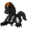
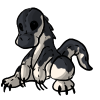
Yay!
* They are a lot more Kitty-friendly in code. (Neater and easier to edit).
* You can now choose which items you will give to complete your errand. :D
ALSO:
You can now access the overlay store, which is run by Macy:

And you can buy an overlay license from the scale shop, too.
We also have 2 new plushies, colored by Kitei:


Yay!
Art Theft
Posted by Kitty (#1) on 7th Jun 2011
So it was brought to my attention that a couple of people on DeviantArt were stealing artwork from Exhibited, printing them out, tracing over them and uploading them as their own work, with the art from Exhibited "referenced" (mind you, this was not credited in the description.). This is.. Well, not allowed. The copyright lies solely with Exhibited and the original artist; each image was paid for and created (many hours of hard work from our wonderful artists!) for the sole use of Exhibited, so that you can see what your dinosaurs look like.
So I'd just like to reconfirm a particular section of the terms of service for everyone:
"Exhibited's images, text and overall content is copyrighted (c) to me, the owner of the game, & original artists. You agree not to take any picture, edit it or otherwise and pass it off as your own, unless you first have written permission from me."
Please don't take artwork that is not your own.
Positive Edit: The pooper scooper is available in the scale shop. :P It comes with a whopping 750 uses and will fully clean your enclosure, as requested on the suggestions board.


MINI COMPETITION
Posted by Kitty (#1) on 1st Jun 2011
So I have a mini competition for you guys, where every user who participates will guarantee themselves a small prize:
A zombie cookie. I believe this item was very popular due to boosting +45-50 on all 3 stats per dino when used, so I'm hoping it's enough to tempt you to participate. ;)

All you have to do is:
- Draw "EXHIBITED" on a piece of paper, card or similar.
- Take a picture of you holding it up, but where the paper/card etc is hiding your face, so you can only see the card & writing and your fingers. Optionally you can add your user id too.
- Upload it to tinypic or photobucket or imageshack and send me the link in a message.
- Get a zombie cookie & help Exhibited out
- ????
- Profit.
:D
An example image for another game is: here.
Entries must be in by Wednesday the 8th of June, so you'll need to be quick!
Thanks guys!
A zombie cookie. I believe this item was very popular due to boosting +45-50 on all 3 stats per dino when used, so I'm hoping it's enough to tempt you to participate. ;)

All you have to do is:
- Draw "EXHIBITED" on a piece of paper, card or similar.
- Take a picture of you holding it up, but where the paper/card etc is hiding your face, so you can only see the card & writing and your fingers. Optionally you can add your user id too.
- Upload it to tinypic or photobucket or imageshack and send me the link in a message.
- Get a zombie cookie & help Exhibited out
- ????
- Profit.
:D
An example image for another game is: here.
Entries must be in by Wednesday the 8th of June, so you'll need to be quick!
Thanks guys!
- Game Statistics[ – ]
-
- View Full Statistics
- Dinosaurs: 130,156
- Members
- Online: 1
- Total: 38,900
- Upgraded: 4,323
- Moderators: 9
- Newest Member:
- New User (#38900)


