Add new Bookmark
Do you need some help? Enter your problem or question below and an Exhibited Guru will get back to you. If you have a serious problem, it might be best to ask a moderator instead by selecting "Mod Box" from the drop down. Remember, this isn't for reporting bugs.


Artwork: Show Off

Post all artwork that you'd like to show off here! Also, a good place to ask for crits and redlines.


Overlay crit: Ask the mods v2
Hey!

This is the re-post of a topic we created a while ago, the purpose of which is for players to ask for crit and/or advice from moderators about their overlays. This can be what needs fixing in order for it to be accepted, what we'd recommend improving, etc.

In order to conserve serverspace and maintain quality, kitty has decided that we should tighten up on future submissions. Older submissions will not be removed even if they don't fit our newer criteria, but in order to help clarify our updated strictness, we've created this preliminary location for players to use :)

-Basically this just gives you a chance to find out if you're going to be accepted/rejected without having to submit the whole deal-

Please be aware that our replies will be made up of constructive criticism and advice on how to improve the overlay - it isn't to show off or gather compliments from players. Please also understand that what we say is not due to any personal issues, etc, and is purely professionally-related. Additionally, this is not mandatory for mods: We are volunteering out time to specifically spend on improving your artwork, so please be mindful in any and all frustration you might have ;3;

Multiple mods may comment on your overlay, or maybe just one. Either way, please don't disregard one's advice if somene else says something you prefer - each opinion is as valid as the others.

---

So, how this will work:

Player Posts
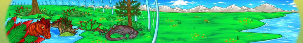
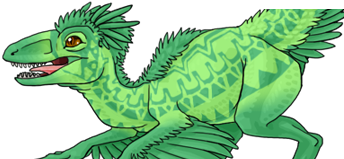
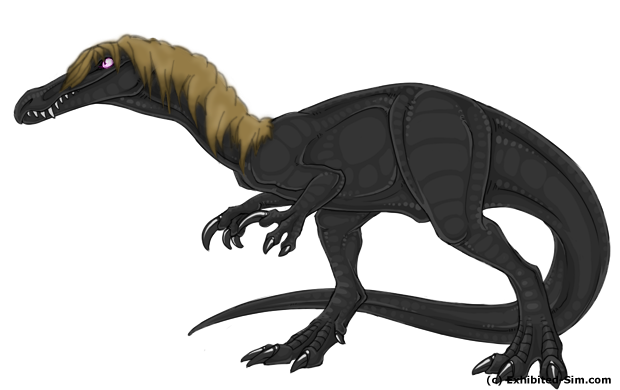
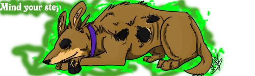
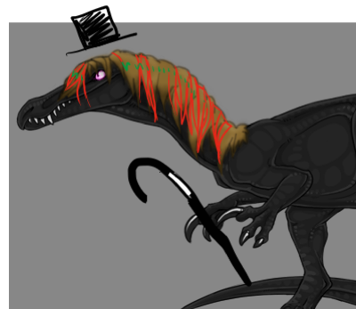
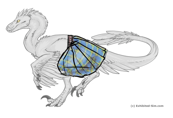
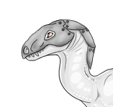
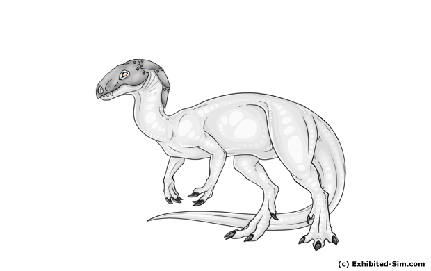
Post a picture of your item on the dino it's supposed to be on.
include a title or brief description - just to let us know what it is in case we get confused XD

After you get a reply, feel free to respond and/or post again with an updated picture


Mod Crit Form
Necessary Changes: This section will mention changes that your overlay must make in order to be accepted. They give an idea of the hard criteria we want overlays to meet and details on the aspects we're strictest on can be found here

Recommended Changes: This section is more of a general critique. Listening to these will probably increase your chances of getting your overlay accepted, but they're more specifically targeted towards creating a stronger image than towards specifically getting the overlay to match EX standards.

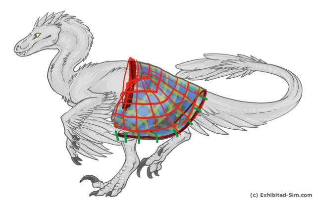
(optional) Redline: Sometimes mods will be willing to spend a bit of extra time going over your picture to show you visually what can be improved/etc.

~Kitei-san~ http://i1039.photobucket.com/albums/a475/Nox_demon/KitiesBaby.png
Post: #240565
Yay, I've been waiting for a remake, since I didn't want to bump up the old thread. :D

Anyways, here's a body armour for Archaes that I did in the beginning of April. It's based on Xylax's Dark Spiked Body Armor for Sinorns (without the spikes xD) and with some tweaks here and there for a little uniqueness. The colours can be any combination-- so I could still slap a grey hue to it and call it silver. :P

archaeopteryx_armor01_ex01.png

Thanks for doing this again! <3
My time: GMT+1 (EX time + 8 hours)
Post: #240619
You're welcome, I'm so glad to have such a positive response to this thread so far ;u;

This overlay is lovely, btw. but let's get the crit started

Necessary Changes:
Not much needs changing here, everything is nice and within the lines
One thing, though, is the shading. love how it looks on his chest, but on a lot of other areas it seems a bit fuzzy and non-definite? I might recommend trying to throw in a bit of hard-edged hightlights and shadows and possibly a bit of subtle scratches here and there? it might help it give the armor a "solid" feeling

Recommended Changes:
I'd love to see a bit more detail/mechanical thought put into the wing joints on the armor! I see that you can identify the spots that need the most mobility, but it's not very clear how the red areas on them will actually help them flex more.
Additionally, I don't actually think making the lower jaw in the armor is necessary for the appeal. leaving it might make it seem more "armor"-y and less "robot"-y, but this is just an optional suggestion, as I said XD
(example of horse armor with only the top covered: here)

Also, as a note on armor: it's sometimes a cool idea to try mixing in some greens and other colors into armor to imply A. reflections and B. rust. It helps give it a worn in feel, though overdoing it can obviously make it look too beaten up or muddy XD Xy's armor was (I believe) intended to look like the metal had been painted, but naked armor might actually end up getting extra colors

seals seals seals
Post: #240934
I'm not very good at this but im trying to improve.

im not sure what i should call this.. maybe horse hair ? lol

horse-hair--bary.png

i know it needs a lot of work but im not sure where to start...
Had an account since 2012. Attempting to jump back in. I Have Bary, Linhe, and T-rex
Post: #240948
Maybe put some more hair detail in it and add lighting?

Hehehe, sorry, I know I'm not a mod, but I was itching to try and help. ^^'

Formally Joker's Girl.
Post: #240949
okay thanks :)
Had an account since 2012. Attempting to jump back in. I Have Bary, Linhe, and T-rex
Post: #240951
No prob. :D

Formally Joker's Girl.
Post: #241000
A kilt for them linnies!
Photobucket
the overall shape of it is pretty much what i've gathered up about it the few times i have actually seen people wear kilts, so it's hopefully accurate.

edit: and i'll get rid of the bit of bleeding later :)
~Call me Nyx
Post: #242307
Derp, sorry about the delay guys! Lemme do a nice big crit for each of you, and thanks for your patience ;3;

-Gobbles!-
Looking pretty nice, hair is a confusing thing to deal with, and I'm not really very good at it, but I'll see what I can say!

Necessary Changes:
A few things are necessary to completing this piece for EX. First off, you need to harden up the lines to match the EX linequality. They just need to be opaque and clean :> You might be able to do that by just duplicating the line layer a few times and then cleaning up, if you don't wanna draw over them.
Second thing is you gotta make sure to color all the way to the lines. Don't leave any transparent pixels between the color and the lines, otherwise it's gonna look like he's got green hair when he's on a green background XD
Finally, you should probably harden up the shading. Think of shading in two parts: The main shape shading and the textural shading. Shade the whole thing as it it were a solid object at first, making sure to add dark solid colors near the base and anywhere else not getting hit by direct light. Texture comes second where you add the implication of strands across the hair.

Not a very in depth tutorial, but this shows the concept of painting hairflow without needing to draw individual strands - link

Recommended Changes:
Adding lineweight to this piece might really help. Varying line-width along hairstrokes tends to really add to their sense of organic-ness, which is always awesome. Also, adding more lined "clumps" of hair like you did near the face would help solidify the rest of the mane, since the rest looks almost liquid-like without some concrete lines to hold it in place.

Additionally, the strands near the nose seem to be defying gravity XD I understand some of them laying against his nose, but the lower ones seem like they'd start falling off his face in that cool way that messy hair does. Something like this though you can definitely do it more controlled XD That image also shows how horsehair naturally tends to form these little locks, which give good implications of where you can add more solid lines.

Redline:
just quickly scribbled in some hairclumps and gravity affect. The green is just some places you could add harder highlights to help give the mane a nice sheen, since hair takes to highlights pretty well
EX_barymanebobd.png

Nox, I'll do yours on a separate post, just to keep the crits separate :D

seals seals seals
Post: #242323
-Nox!-
kilt_red2.pngkilt_red.pngHerbal already posted my redlines, sorry I didn't do a crit at the time XD I was in a rush and there was some degree of confusion going on. Glad you resubmitted this, I would love to see more dinos in kilts!

Necessary changes
you already mentioned your colorbleed XD so that works out
Two things that I think are really necessary here though: A bit of line cleanup - your lines here are sort of wobbly and all, particularly around the waistline. You can probably fix them up with just a bit or brushing and erasing though c:

Secondly, the folds on this are still somewhat confusing. I'm not really sure what the wobbles near the knee are? if they're folds, they could use some fold lines extending from them to clarify. Also, since the kilt should be pulled fairly hard along the bottom seam from the pose, you shouldn't really get any deep leg-hugging folds there, but more stretch folds instead. You can experiment with this definitely, but it might be a good idea to try to hold a napkin or something along a seam to make a tubeshape and then fiddle with it to try to see how the fabric will stretch and all. Cloth is a confusing creature, so it's always good to get ref when possible!

Recommended Changes:
I'm not really sure if this should be necessary or recommended, but the lines on the kilt are changing direction mid kilt XD I don't know if this is intentional, since maybe dinosaur kilts need to be manufactured differently from human kilts, but assuming this is made like a human kilt, the lines parallel to the belt/bottom should remain parallel to those two XD. I scribbled the lines on the first redline I did, to show what I meant. Additionally, I realized that it might be difficult for all those vertical lines to head up. Traditionally, I believe kilts are wrapped around around 1.5 times, so they have a hidden overlap, but I drew a pleated version as well, since that's an option for showing conservation of length.

Secondly, I like the depth you've added to the shadow/highlight highs and lows, but it might be a good idea to harden some parts of that up a bit? just to give it less of an airbrushed look. Cloth doesn't need very hard lights/darks though, since it tends to have a somewhat velvety nature to its lighting. Just notice that particularly firmer cloths tend to pick up some harder divisions between light/dark sometimes
link

Finally, I love that you added buttons, but the fact that they vary in size seems confusing. If the intent is for them to be different sizes, making the first two large ones the same size and making the small one distinctly smaller might help show that it's intentional, and not just last-minute detail. I love them as a detail though. it helps add a lot of context to the piece even though they're so small <3

Redline:
Already did the redline, so I'll just do some final comments on it.
There's a lot of compression going on between the belt area and the left thigh, so the cloth is going to bunch up a lot there, which is part of what I was trying to do in the redlines.

Additionally, love the button detail, as I mentioned. If you wanna push that further, you could possibly add in visible belt loops (if you're going for a more modern kilt style) and/or seams, etc. that being said, I know there are a lot of different styles of kilts, and I'm not well versed on them, so I can't really recommend too many details without a bit more research.

Anyway, again, thanks for your patience <3! Hope that was helpful :D

seals seals seals
Post: #242476
Thanks bob ^.^

p.s- love the scribble top hat :D
Had an account since 2012. Attempting to jump back in. I Have Bary, Linhe, and T-rex
Post: #242535
no probs <3 XD
I really like drawing on people's stuff ;3;

seals seals seals
Post: #242564
thanks, bob!
that...overdraw ;A; must remake it!
the advice was very helpful, thanks! just the ruffles confuse me: the kilts i see worn in all the remembrance day ceremonies by the bagpipe players -never- have ruffles. is it just a style? or something else?
~Call me Nyx
Post: #242596
I thiiink there are some ruffled kilts, but I'm not actually sure. I know greatkilts are just rolled a lot, so there's a lot of cloth, but no sharp ruffles, but there are some variances like this and this that show them? I guess it's a more casual style.

Mostly just wanted to toss out a possible suggestion, since I was thinking about how to make the vertical lines cone out like that.

oh, found a greatkilt too, because they look cool: link

edit: also, housemate pointed out that I should be calling them "pleats" not ruffles

seals seals seals
Post: #243991
herrara-light-armor-head.pngherrara-light-armor.png


here is some light facial armor.
I'm not sure what else to do to it though.
Had an account since 2012. Attempting to jump back in. I Have Bary, Linhe, and T-rex
Post: #244067
I'm jealous! I wish I was pro like you guys! XD Oh well, I'll leave the pro art to you guys!
ARK is my life
Post Reply