Exhibited Press - Comments
Poll
Posted by Kitty (#1) on 27th Jun 2011
122 Comments
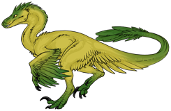
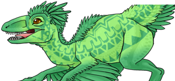
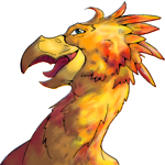
Okay guys, here goes. Which banner do you like best?
The one we have now? Or this one?
click!
Ignore any side bits that blur into the background, all I'm talking about in reference is the image itself and the overall style.
Comment here with your opinion? :)
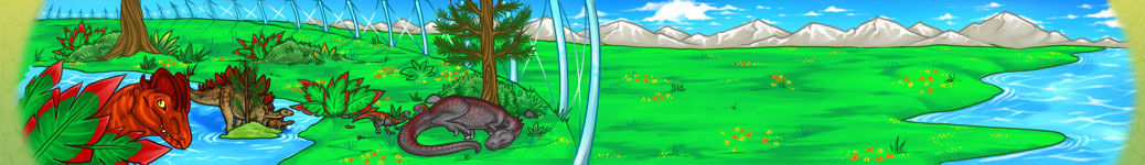
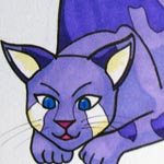
The one we have now? Or this one?
click!
Ignore any side bits that blur into the background, all I'm talking about in reference is the image itself and the overall style.
Comment here with your opinion? :)

By Pideaux (#8001) on 27-06-2011 04:15:35
Ooh... I quite like the new one - But both pretty equally to be honest. Change is always good, however. :3 - The foliage on the older one looks amazing. The dinosaurs on the new one I'm quite keen on. Good work nonetheless. :3
By Owl (#4363) on 27-06-2011 04:16:35
I quite like both, honestly. :D
Buuut... I think I like the new one best. XD Just because it has a dilo on it. *is biased like that*
Buuut... I think I like the new one best. XD Just because it has a dilo on it. *is biased like that*
By Mod Herbal (#4) on 27-06-2011 04:20:48
I like the new one best, but I think perhaps more greenshades in the grass inside the dome would make it look even fancier.
By Paya (#2473) on 27-06-2011 04:50:24
I like the new one. Hard to explain, but the lines look more solid, less vague. Plus, change is good.
By ♪Protoman00♪ (#8611) on 27-06-2011 05:27:39
Keep the old one. It's AWSOME!
By Reptilelover34 (#904) on 27-06-2011 06:02:35
I like the one we have now.

By Eltafez (2nd) (#333) on 27-06-2011 06:04:01
I like the new one. I like how the new dinosaurs look better.
By Nia (#8831) on 27-06-2011 06:09:20
Voting for the link. I love the current one's style, but I love this one too, plus it reflects the current dino art more.
By Mod Clara (#2793) on 27-06-2011 06:09:40
I like the dinosaurs in the new one more, but prefer how detailed and nicer the scene looks in the old one.
By IndieGo (#212) on 27-06-2011 06:10:43
I like the old one-- the 'new' one makes the dinosaurs look unattractive, to me.

By Nosredna (#8940) on 27-06-2011 06:26:02
if you can touch up the new one then thats my vote
By Killick (#836) on 27-06-2011 06:38:55
I like the old one better like Clara said the art style is better but I also like the new ones dinos. Maybe you could use both from time to time if you wanted to?
By Bakura (#738) on 27-06-2011 06:46:40
I like them both equally, but maybe you can change them every once in a while? It's really cool though. =D
By Kiseki (#7969) on 27-06-2011 07:00:05
i like the one we have now. the other one is fine but this one is beter
By Nanave (#7827) on 27-06-2011 07:02:28
I prefer the new one better, I think it would be nice to have something new.
By Willow (#7596) on 27-06-2011 07:03:17
I like the new one, however I like how the current banner seems more 'sunny' and open, with the blue skies and clouds. That's my only "issue" with the new one, it just seems a little less bright :)
By New User (#7475) on 27-06-2011 07:05:08
i think the one we have now is the best
By cave101 (#371) on 27-06-2011 07:06:00
i really like both banners

By Prince (#2625) on 27-06-2011 07:16:20
Oh gosh this is hard. I agree with most everyone who have answered. I love both: The landscape in the first one is lovely and the dinos in the second are lovely. Since we are going through a change, I'd say the new one I like best by a small fraction :)

By Car (#662) on 27-06-2011 07:20:01
The new one. It's clearer and the dinos in it are more realistic then the old one.
By Cheeze (#6168) on 27-06-2011 07:29:38
Tough Choice. I like both of them. I think there should be an option for you to decide if you want the old one or the new one. The new one has a herbivore in it, so I don't know. But I'd go with the new one, it's always good to spice things up a bit :)
By SwirlingFire (#5566) on 27-06-2011 07:32:41
i think the new one is best
By Witch King of Angmár (#2167) on 27-06-2011 07:41:49
hard to choose... *thinks* ehhhhm, i think...
the new one
the new one
By Sen (#551) on 27-06-2011 07:50:46
I like the detail in the foiliage of the first picture, and I like the style of the dome better in the first one...I like the dinos in the second better.
Except one thing: I really don't like the color of the one in the foreground. They're so alarming and clashing that the lineart doesn't show very well, and the shading doesn't show on it very much. I'd personally like it better if it was toned down slightly.
Except one thing: I really don't like the color of the one in the foreground. They're so alarming and clashing that the lineart doesn't show very well, and the shading doesn't show on it very much. I'd personally like it better if it was toned down slightly.

By Sayl (#315) on 27-06-2011 08:10:58
I have to go with the new one. I think that having the animals in what we use on the site, is a good call. And before I couldn't tell what the dinosaurs were on the banner. I kept guessing but failed. But yes, the new one for the reasons above.

By Pythios (#5061) on 27-06-2011 08:12:36
this one
By Dino Overlord (#2404) on 27-06-2011 08:18:14
i like the new one better
By Kitten4502 (#9757) on 27-06-2011 08:25:56
I like the new one.

By Taura (#21) on 27-06-2011 08:29:15
new one :)
By Kikin1one (#4272) on 27-06-2011 08:29:30
I like both but my idea is that you change the banner of the year like the new one for spring or summer and for the old one do the same thing, or you could do it in a way that ever time a page loads up, the banner changes. Any way they both look GREAT!
By New User (#5305) on 27-06-2011 08:33:15
Well over-all i like it i like how it shows a Dravidosaurus there; thus making it clear we have herbivores. But i feel it's lacking plant-life, unlike the one we have now
By New User (#3753) on 27-06-2011 08:41:54
I like the old one. Being able to see the sky, mountains and trees makes it seem grander lol
By Xtopo (#9388) on 27-06-2011 08:54:28
I'd say the old one. I like the view, the foliage, and the dinos in the old one are awesome, but they could look a little more detailed.
By Alice (#564) on 27-06-2011 08:59:15
I like the old one. Mostly because it looks more real then the new one.
By New User (#877) on 27-06-2011 09:03:17
old one!
By UNI (#9762) on 27-06-2011 09:10:52
the one we have
By Nox (#8929) on 27-06-2011 09:12:08
i like both. maybe we could have an option to change it if we wanted?
By Frankie (#6808) on 27-06-2011 09:17:12
I like the newer one better because it has better graphics, better dinosaurs, better coloring. It is awesome.
By Cinnamon Bubbles (#1978) on 27-06-2011 09:19:52
I prefer the new one [:
By Dratini (#1963) on 27-06-2011 09:20:15
I like the old one better~ Maybe make it a choice in the user settings which banner they would prefer?
By New User (#9741) on 27-06-2011 09:23:57
I like the new one. :)

By Ex Nihilo (#2755) on 27-06-2011 09:34:54
I like the current one better.
~Ex Nihilo
~Ex Nihilo
By Director (#307) on 27-06-2011 09:45:58
Great!
By Mod Feather (#958) on 27-06-2011 09:55:16
ahh! I can decide! I like them both! But I agree, that the dinos in the second are more detailed and nice, and the background in the first is nice and detailed XD
By ~ LunaOfMidnight (#151) on 27-06-2011 10:10:13
Oh, This Is A Hard Decision. xD Um, I Like This One, But I Think That One Would Be Nice To Have. :D
By feralhydra 2 ( kristy XD) (#6068) on 27-06-2011 10:18:42
i like the new one
By Ninja of Destiny (#283) on 27-06-2011 10:48:15
i like the old banner the most.

By Spyre (#3768) on 27-06-2011 11:07:49
I like both, but I have to say the new one. Those dinosaurs are more detailed, so I would have to say the new one.
By Wrathe (#5951) on 27-06-2011 11:18:20
I like the old one. Looks a bit better with the style it has and all. Still the new one is pretty good, only thing I don't like is the open space beyond the enclosure.
By New User (#9655) on 27-06-2011 11:32:17
I like the one we have

By Tyrannogon (#5461) on 27-06-2011 11:37:09
I like the the new one slightly more
By New User (#9713) on 27-06-2011 11:38:48
I think the new one you made is the best. It's super cute :)
By Witojeruhi (#8905) on 27-06-2011 11:50:06
Truthfully, I like the one that is up now.
By Padraic (#544) on 27-06-2011 11:57:24
the new one is what i like the best
By Mary (#9457) on 27-06-2011 12:03:01
I like it, but if you don't change it i'm not gonna like have a cow or anything
By Da-Sky (#3140) on 27-06-2011 12:13:43
:/ i like the old one. overall better quality IMO. plus the colors we have right now are brighter and everything is sharper and clearer. the new one just seems... blurry.

By Mod Zani (#2255) on 27-06-2011 12:43:13
I like both of them, but I think the foliage/rocks/water/etc. look better in the old one. Like a lot of people said I really like how the dinosaurs look in the new one though. I think I'd be happy either way, but it'd be a nice to have a change. :o
By Silent Lullaby (#3074) on 27-06-2011 13:10:19
i like the new one better!
By Silent Lullaby (#3074) on 27-06-2011 13:12:39
i like the new ones dinos better but i like the style of the plants and background on the old one
By Mastermind (#8907) on 27-06-2011 13:18:44
My vote is on the new one, but I think the stegosaurus in the same enclosure with the carnivores is unrealistic. If you could touch it up, maybe add multiple enclosures in the backround, then I personally think it would be a lot better.
By Capell (#8239) on 27-06-2011 13:27:08
I really like the new one! So vibrant.
By Pod (#8632) on 27-06-2011 13:27:27
i like the new one better.

By UnwrittenTale (#3511) on 27-06-2011 13:41:35
I prefer the one that we have, but if the entire layout changes along with it, I might change my mind. xD

By New User (#9516) on 27-06-2011 13:59:24
I like the one we have now :)
By Youme (#7875) on 27-06-2011 14:04:05
the one we have now
By Star (#1753) on 27-06-2011 15:00:29
I like the new one, but I think it should have a little more detail in the foliage like our current one has. =3

By Mod Bob the Dragon - not a robot (#643) on 27-06-2011 15:19:36
if the new one were touched up a bit - a few more shades added. shadows under dinos showing up, more foreground/background contrast and tightened up drawings (particularly on the lying down dino) I'd like it a lot more XD. as is, the current one feels more professional to me. It doesn't reflect the style of the site as much, but it does reflect stylistic choices and willingness to put in the time to clean up and add details to the art.
By Toki (#9654) on 27-06-2011 15:21:05
Hm, tough decision. Both are really good, but I'd have to go with the new one. It's a bit less crowded, and it's brighter and a bit more detailed.
By New User (#8620) on 27-06-2011 15:22:36
Ohh, hard question!
What I like about the old on is the clear layout, the colours are bright, but it also looks a litte bit unrealistic. The new dinos are great, but I think the foliage is too bright.
Ahhh what shall I say??
Ok, take the new one!
What I like about the old on is the clear layout, the colours are bright, but it also looks a litte bit unrealistic. The new dinos are great, but I think the foliage is too bright.
Ahhh what shall I say??
Ok, take the new one!
By jdino (#8892) on 27-06-2011 16:09:41
I like it!

By Sai (#204) on 27-06-2011 16:40:57
Hrm... Gotta say I like the old one better, but only narrowly. I was never fond of change anyway, so my opinion is a bit biased. XD
By Pizza Cheese (#6922) on 27-06-2011 18:02:44
New one. But the old one is quite good.
By Stormfur (#6066) on 27-06-2011 18:22:49
I like think the old one is the BOMB! Which means I like the old one the BEST!
By Dr. Swagnasty (#9338) on 27-06-2011 18:44:47
The new one is more realistic and detailed, dinosaur wise, but I feel that the old one, despite being more cartoon-like, is more inviting, in the way that it's brightly coloured and bright. The foliage is more diverse and plentiful in the older one as well. Either way, they're both lovely. Great job!
By New User (#6107) on 27-06-2011 20:31:04
I like the one we have now. It really describes the game. And it's beautiful!
By PurpleLover (#6001) on 27-06-2011 21:09:54
i lik da one we hav now
By Snailwatching (#9662) on 27-06-2011 21:18:18
This one now! I just like it better...
By Mod Spotty (#785) on 27-06-2011 21:36:48
I like the style of the one we have now more than that one, though the red dino all the way to the left on the new banner has my love and attention.
By Jade (#7902) on 27-06-2011 21:46:41
I personally like them both, but I think you should put in an option to choose which one you want. That would be awesome!

By Whitefire (#4520) on 27-06-2011 21:57:45
I prefer the current image

By Kitt (#254) on 28-06-2011 00:51:18
I like the current one better,but I also like how you utilize the new patterns and colors...
Maybe you could revamp the current one? ^.^
Maybe you could revamp the current one? ^.^
By Silverstarz (#7531) on 28-06-2011 03:37:02
I like the current one, it looks nice and clean. The new one just doesn't appeal to me at all.

By Nyctra (#244) on 28-06-2011 04:59:43
I like the old one, but maybe that's just 'cause I'm more attached to it.

By Cora-roar (#6452) on 28-06-2011 05:08:45
i like the old one the best
By New User (#287) on 28-06-2011 09:38:37
I like the one we have best! :)
By Stealthy (#8817) on 28-06-2011 11:34:44
I like the old one better, both the style, and the amount of foliage content. The new one just looks a bit barren.
By mewster (#4411) on 28-06-2011 13:26:08
i really like it. both of them are cool. i think we sould try somthing new for a change
By Elite (#4611) on 28-06-2011 13:42:34
Well I love both, but however I like the new ones dinosaurs better.
I like how our old one is all sunny and open, and has all the vegiataion in it.
I like how our old one is all sunny and open, and has all the vegiataion in it.
By KCNM (#2607) on 28-06-2011 14:43:20
I like the one we have now, i don't like the look of the dinos on the new one, in my opinion they look unatractive :(
By MasResik (#9792) on 28-06-2011 15:56:22
I like the one that is up now.
By Blingninja (#8091) on 28-06-2011 16:05:17
The old one. It's a shame to lose it!

By TheGoldenGoose (#8060) on 28-06-2011 17:08:00
i love it!!!!!!!!!!!!!!
By Mirage (#5710) on 28-06-2011 17:50:14
I prefer the old one....
By UGone2Far (#2223) on 28-06-2011 21:18:30
i love the new one
By Wolfy (#3933) on 29-06-2011 01:25:25
new
By $@#!* ass loveable person (#1466) on 29-06-2011 07:01:07
I like both of them. But I think the new one is a little better
By New User (#8793) on 29-06-2011 08:08:52
They are both great but i love the detail in the one we have now, the newer one looks kinda sloppy
By Katie (#36) on 29-06-2011 09:40:33
I like the old one best. It has a clearer crisper image. I feel that the quality is a lot better, and it matches the site's current graphics best.
By Macintot (#3356) on 29-06-2011 09:44:48
I like the one we have right now, though they're both very good.

By Pepper (#7664) on 29-06-2011 11:55:48
I like the original one!
By Eligio (#1437) on 29-06-2011 12:07:56
old one

By New User (#3805) on 29-06-2011 12:29:51
Well I like the new one. Just cause I love new things once in a while. Cause the same thing gets boring after a long time.
By New User (#9873) on 29-06-2011 15:21:06
i am new here but i like the one you have up now!! it is more like the create your own dino theame.
By 🔥 ChildFire 🔥 (#6606) on 29-06-2011 15:25:47
I like the new one. The one we have now has the same dinosaurs on it. The other one has a stegosaurus which I love! So I think you should change it to the new one. All five of my friends have accounts on this game and want the new one too. Thanks!
By WestStar5 (#9767) on 29-06-2011 19:00:42
The one you have now is better. Much more detail and more dinos.

By Courage (#149) on 29-06-2011 21:01:43
The one we have.
By Honey (#173) on 29-06-2011 21:40:36
The one we have now.
By cheese (#7336) on 29-06-2011 22:08:58
i like the background and sharpness of the old pic, the new pic the dinos are more represnative of what we have. like bob said the old pic looks more professional, i have seen many other pet sites and if the first pics you see doesnt look very professional i dont even bother to sign up.
By Furball (#8246) on 29-06-2011 23:02:49
OOOH i love the dinos in the new one!
But the grass and trees kinda scream at my eyes with how bright they are XD
Dinos are heaps better though... hrmmm....
XD put the new dinos on the old background? XD
But the grass and trees kinda scream at my eyes with how bright they are XD
Dinos are heaps better though... hrmmm....
XD put the new dinos on the old background? XD
By New User (#9669) on 30-06-2011 01:05:55
Current one I think.
By PlasmaRaptor (#9462) on 30-06-2011 01:08:34
i like the current one
By New User (#9829) on 30-06-2011 03:23:16
I love this one so much you should be able to set it for yourself *^^*
By New User (#9905) on 30-06-2011 11:57:18
I like the one we now :)
By Dawn (#8663) on 30-06-2011 14:24:20
I like them both!!!
But...............lets stick with the new one
But...............lets stick with the new one
By Wolfie (#9179) on 30-06-2011 14:34:28
I like this one better. The new one's front dilo looks real blurry to me and the current one feflects the fact of one species per enclosure better. Dilos, stegos and the other other one(unsure of species) can't be in the same enclosure in the game, so I like the current one better :)
By New User (#8734) on 30-06-2011 19:11:56
The current one!
By olichocooli (#8848) on 01-07-2011 00:45:13
i think the new banner is best but they both look really good!
By New User (#9940) on 02-07-2011 03:49:25
I like the one we have now. But i wouldn't mind having the new one.
By New User (#10077) on 07-07-2011 08:43:27
i like our current one more
By hamtaro (#7627) on 08-07-2011 11:16:22
i think that we should get the new one it's better and pretty
By New User (#9431) on 10-07-2011 11:05:41
i prefer the current one because ot shows what EX is all about. RAPTORS!!!
By She-Wolf (#6141) on 01-08-2011 20:27:28
the new 1 deffinitly
- Game Statistics[ – ]
-
- View Full Statistics
- Dinosaurs: 130,081
- Members
- Online: 0
- Total: 38,900
- Upgraded: 4,323
- Moderators: 9
- Newest Member:
- New User (#38900)